.png)
Brand system · esports
QLeague, broken down.
One gradient identity — a monogram, a wordmark, a magazine, a sponsorship deck, and event collateral — stretched across the first Dominican-American esports league. This page takes the system apart: the numbers it carried, the case it made, the type, the Q rebuilt live, the repeating chrome, then the whole kit in context.
In my words
Why I'm the director
I didn't inherit QLeague — I started it. There was no Dominican-American esports league, so I built one: named it, drew the brand, wrote the sponsorship model, and ran the events. Director wasn't a title handed to me; it's the job I made and then did for six years.
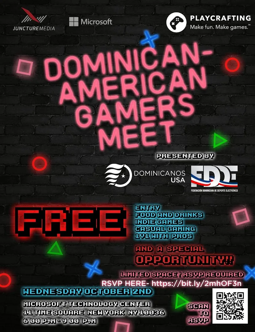
My contribution was end-to-end. I designed the identity — logo, magazine, sponsorship deck, and the site at qleague.gg — then produced the events those assets were for: an “Esports Brawl Hawl” launch at the Microsoft Experience Center in Times Square, an international Street Fighter tournament with MenaRD, and game nights that reached 600+ young Dominican-Americans across NYC and the DR.
I also did the unglamorous half — partnerships and legitimacy. I brought QLeague under the Federación Dominicana de Deportes Electrónicos, got it named in Dominican government press (MIREX), and kept it binational: the same program on both sides of the diaspora, at the same time.
For me it was never only esports. It was a way to give a scattered community a stage with its own name on it — and to prove a diaspora league could be taken seriously enough for a government to cite it.
- Role
- Founder & Director
- Tenure
- 2019–2025 · 6 yrs
- Reach
- 600+ youth · 18+ events
- Recognition
- FDDE · MIREX
By the numbers
What the brand carried
The identity wasn't a logo in a folder — it ran a real, six-year, binational program.
QLeague program figures, 2019–2025.
The case
Why a league, and why this diaspora
The brand was built to make a case — to sponsors, a federation, and a government. These are the numbers that case ran on.
The originals
The finished outputs, first
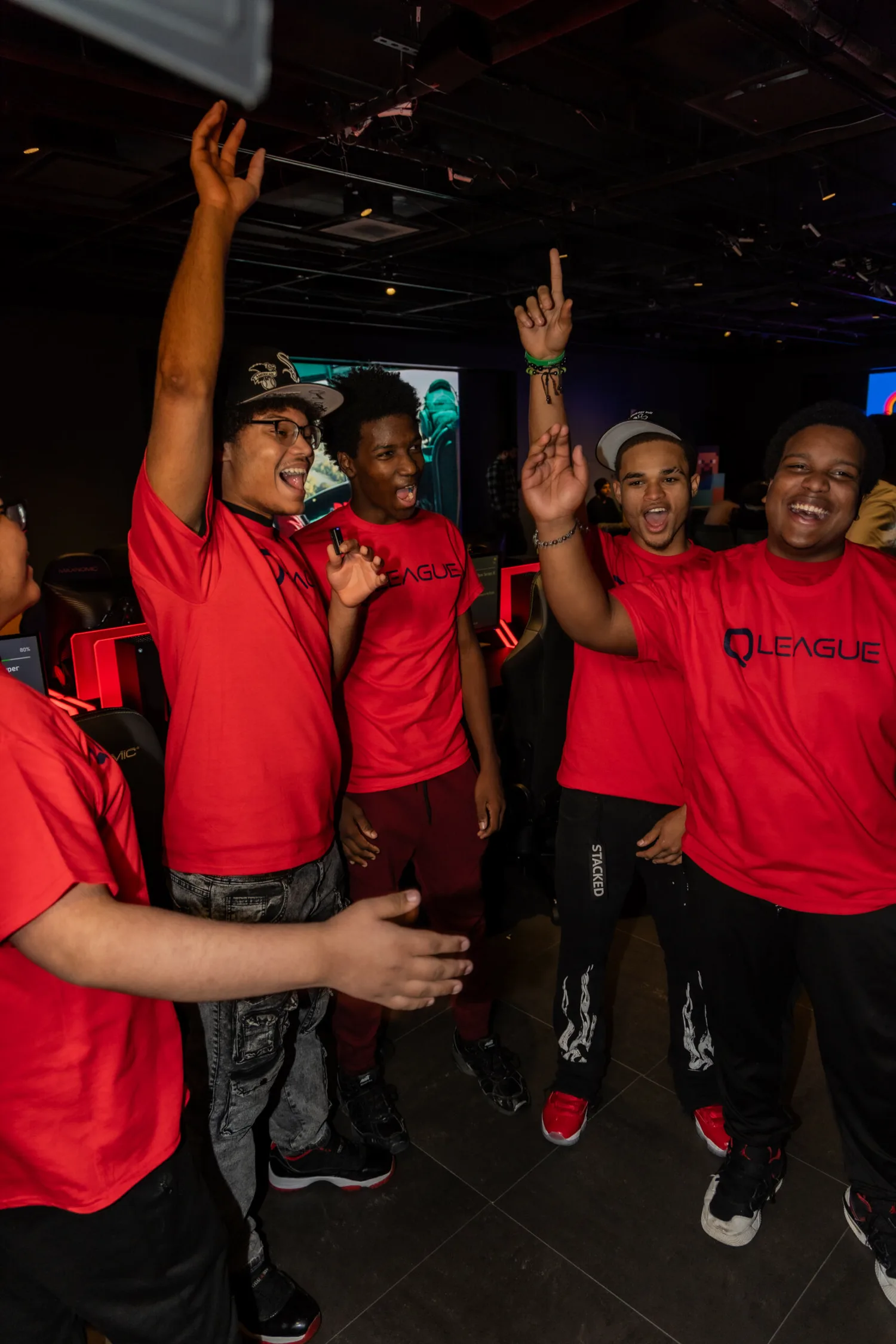
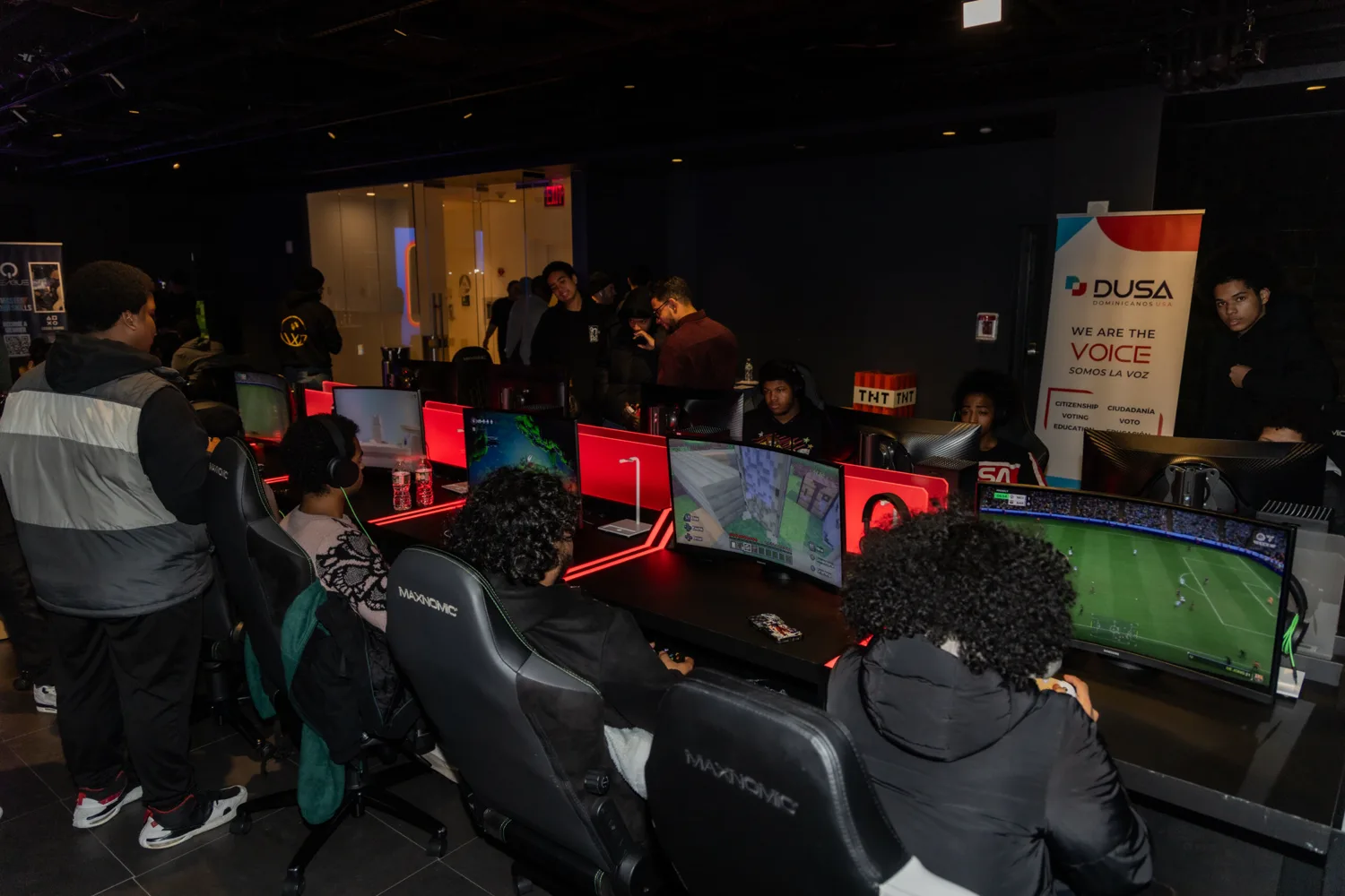
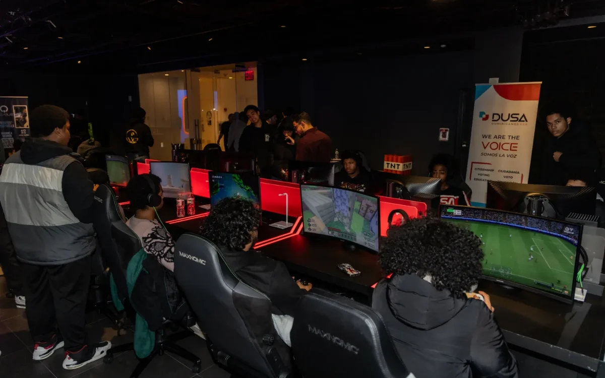
The brand in the wild — identity carried across NYC and Dominican Republic events. (The magazine spread, sponsorship deck, and logo sheet are in the manifest.)
Type
Typefaces + specimens
Type shown here is a closest-match stand-in for the page. The production wordmark was custom-drawn in Illustrator; body/label type followed a clean grotesque.
The logo
The Q, rebuilt live
Not a screenshot — the gradient monogram reconstructed in SVG. Scrub the gradient angle and toggle the neon glow to see how the mark is built.
Ring + tail = the Q; a pink→violet→cyan sweep re-angled per surface. #F00060 → #00F0F0.
The chrome
Repeating components, named
The repeating furniture the system stamps across every surface.
The asset set
The vocabulary the system draws on
Variations
The same system, re-rendered
The same identity re-rendered at other aspects and contexts.

Related work
The pieces, up close
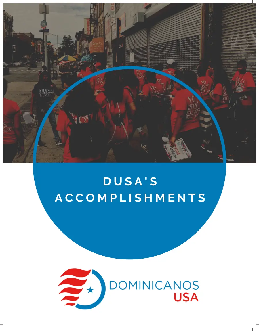
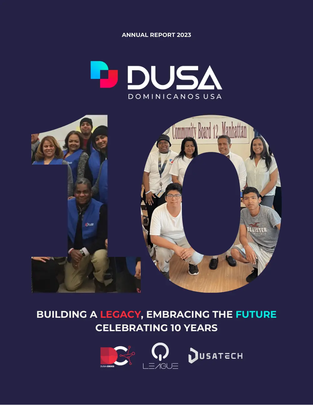
The QLeague designs with their own toolkit pages, and the DUSA reports the program lived inside.
Esports lexicon
Spoken in the scene
The vocabulary the brand, magazine, and events actually ran on.